Making Golem’s large digital offering a consistent experience
Year
2024
Agency
MAD
Type
Editorial Design, Branding
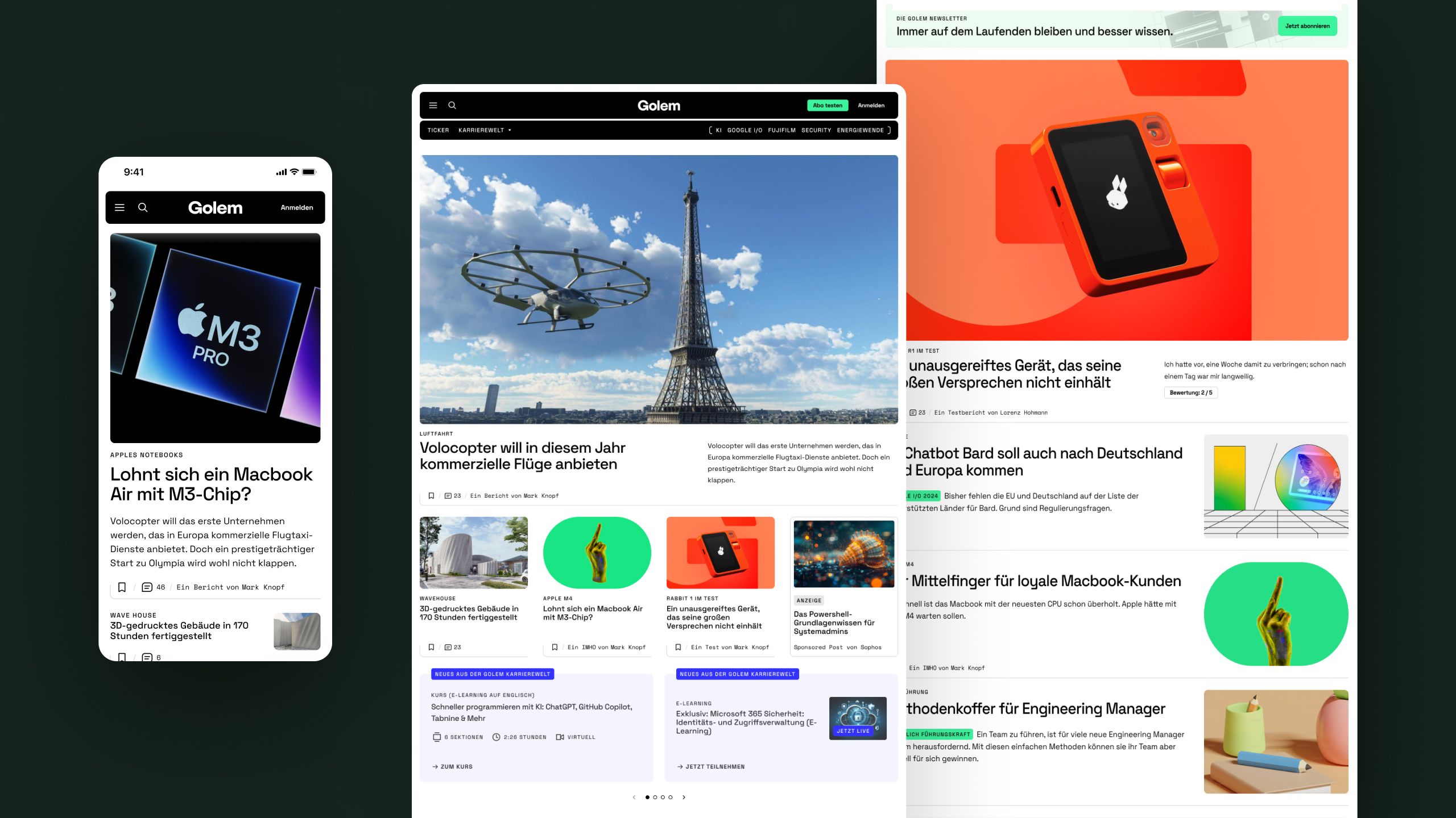
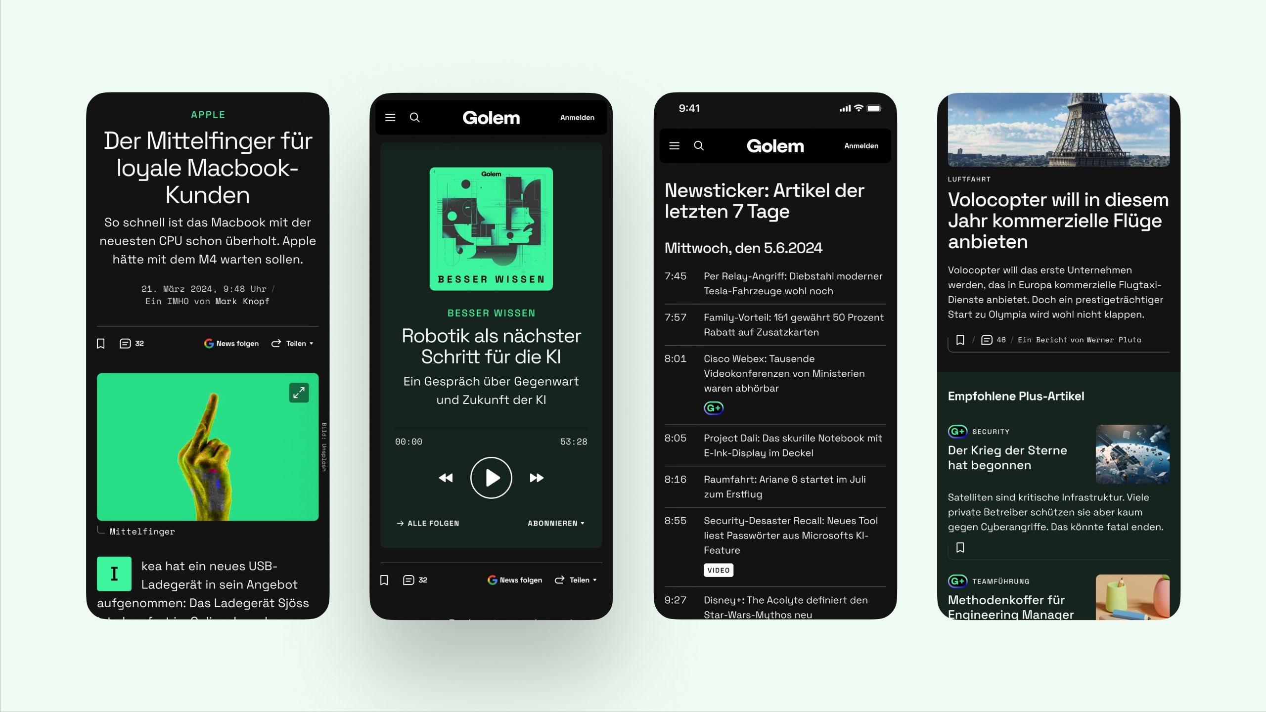
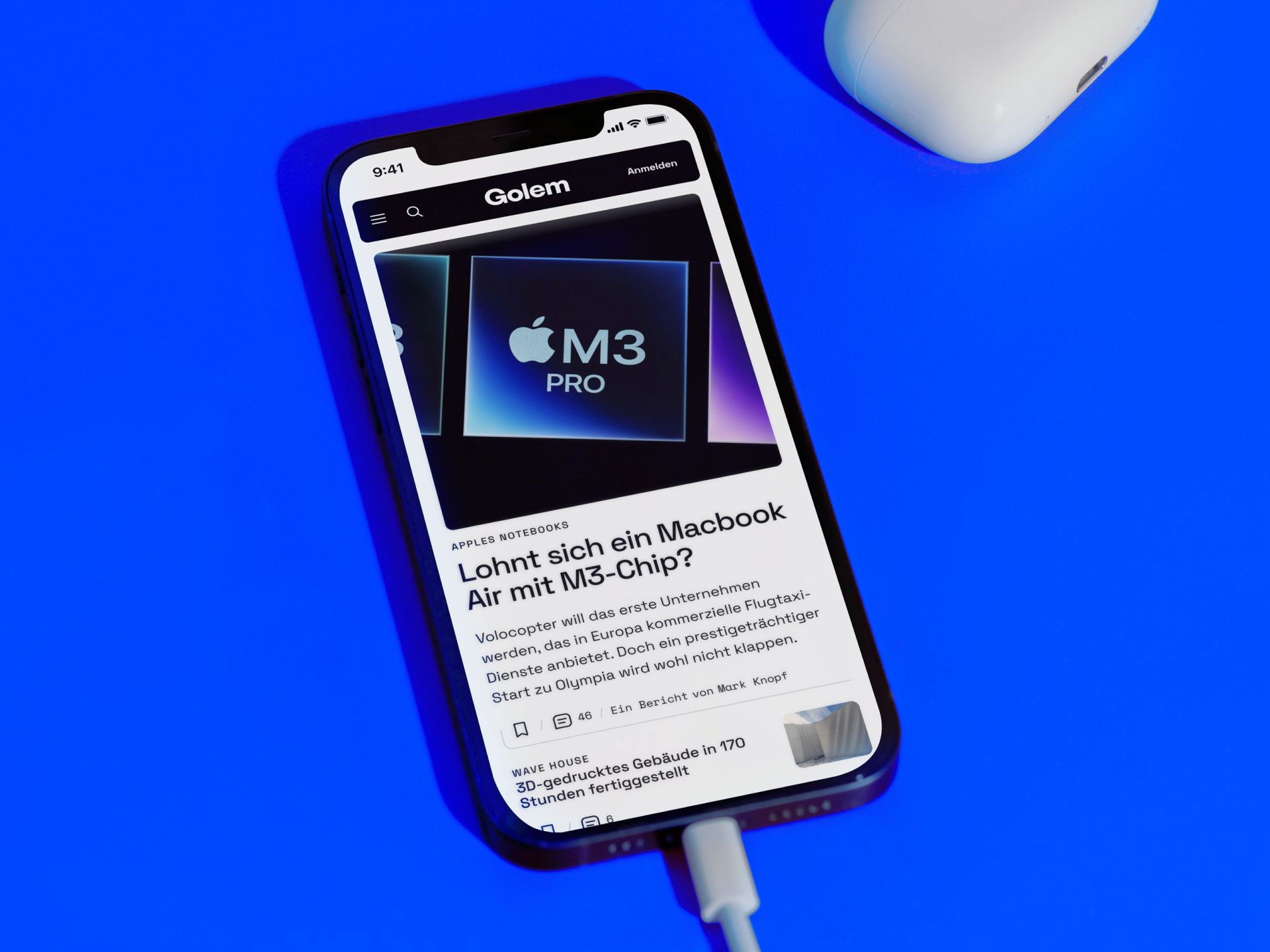
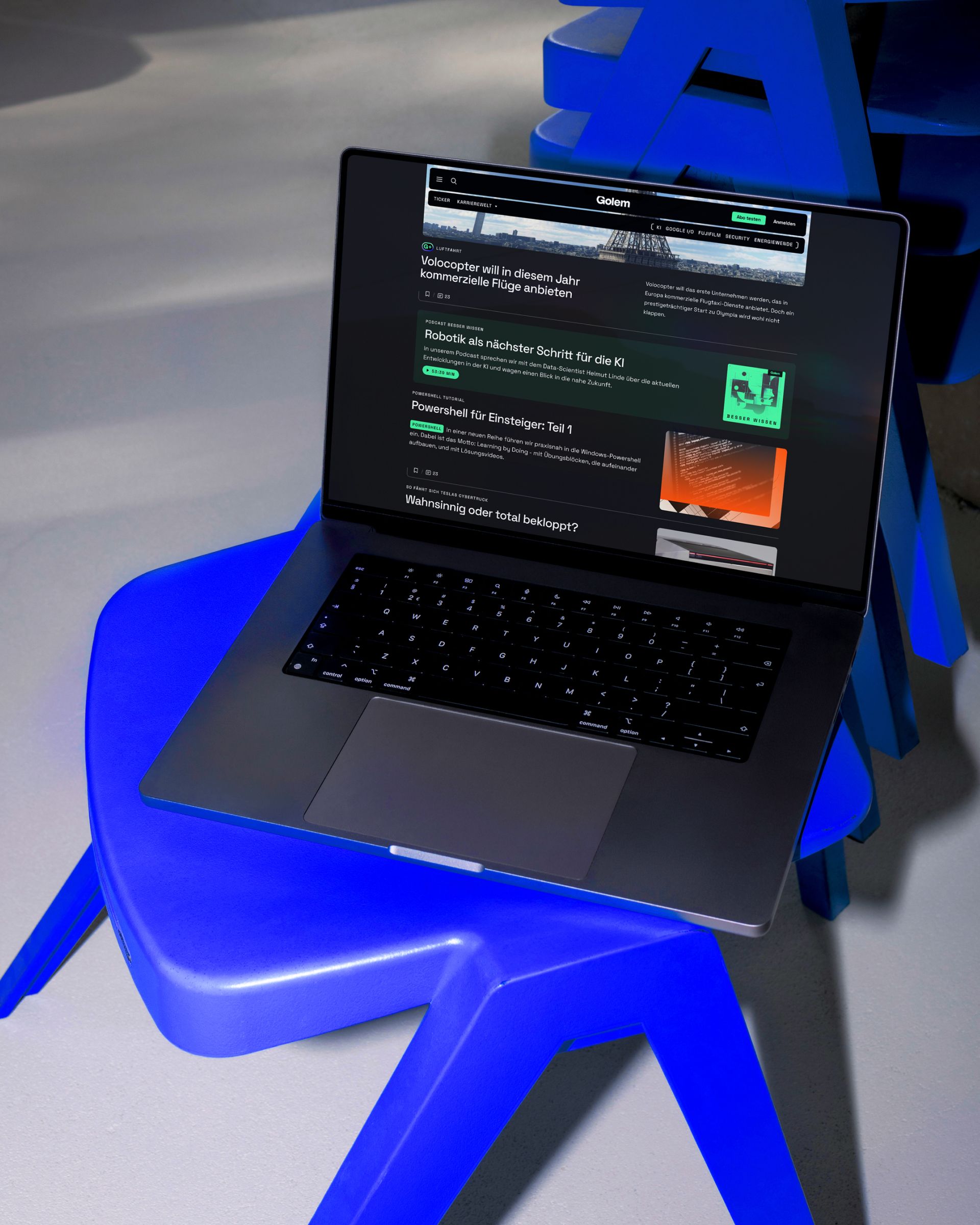
After 14 years without any fundamental changes to the Golem website, it was time for a change to the technical framework and design in order to better reflect the broader spectrum of the editorial offering.
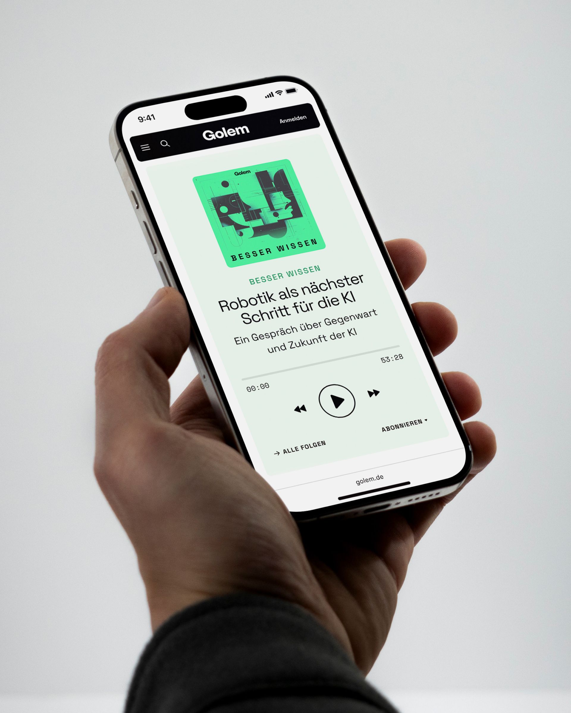
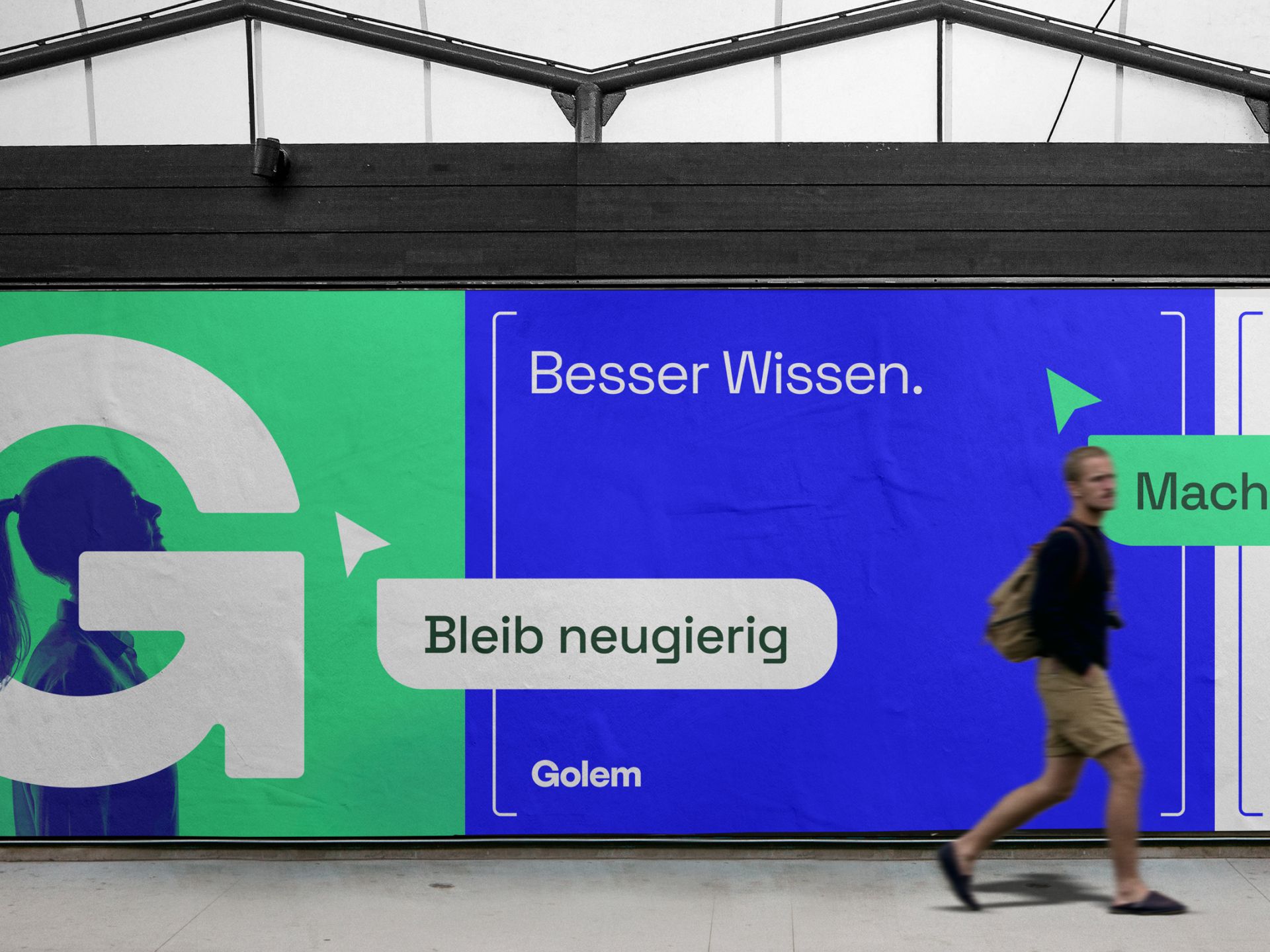
Overall, with the new design decisions we have turned the aesthetics more in the direction of Golem’s origins — namely programming. So the choice fell on a technical-looking font, colours that come from the coding world and the well-known brackets that can be found in various places. And a simplified logo that also represents a refreshing arrow, symbolising the idea of constantly questioning and reinventing oneself.
Collaborators
Jürgen Hassler
Sebastian Waters
Katharina Köth
Philipp Wagemann
Golem.de is one of the leading German platforms for IT news, technology trends, and digital innovation. From breaking reports on software, hardware, and net policy to in-depth analyses, Golem.de provides reliable information for anyone interested in technology, whether professionally or privately. If you want to stay up to date in the digital world, this is the place to find trustworthy news and insights.
Hey