Branding for Løvetann, a natural solution to period pain
Year
2024
Client
Lovetann
Type
Branding
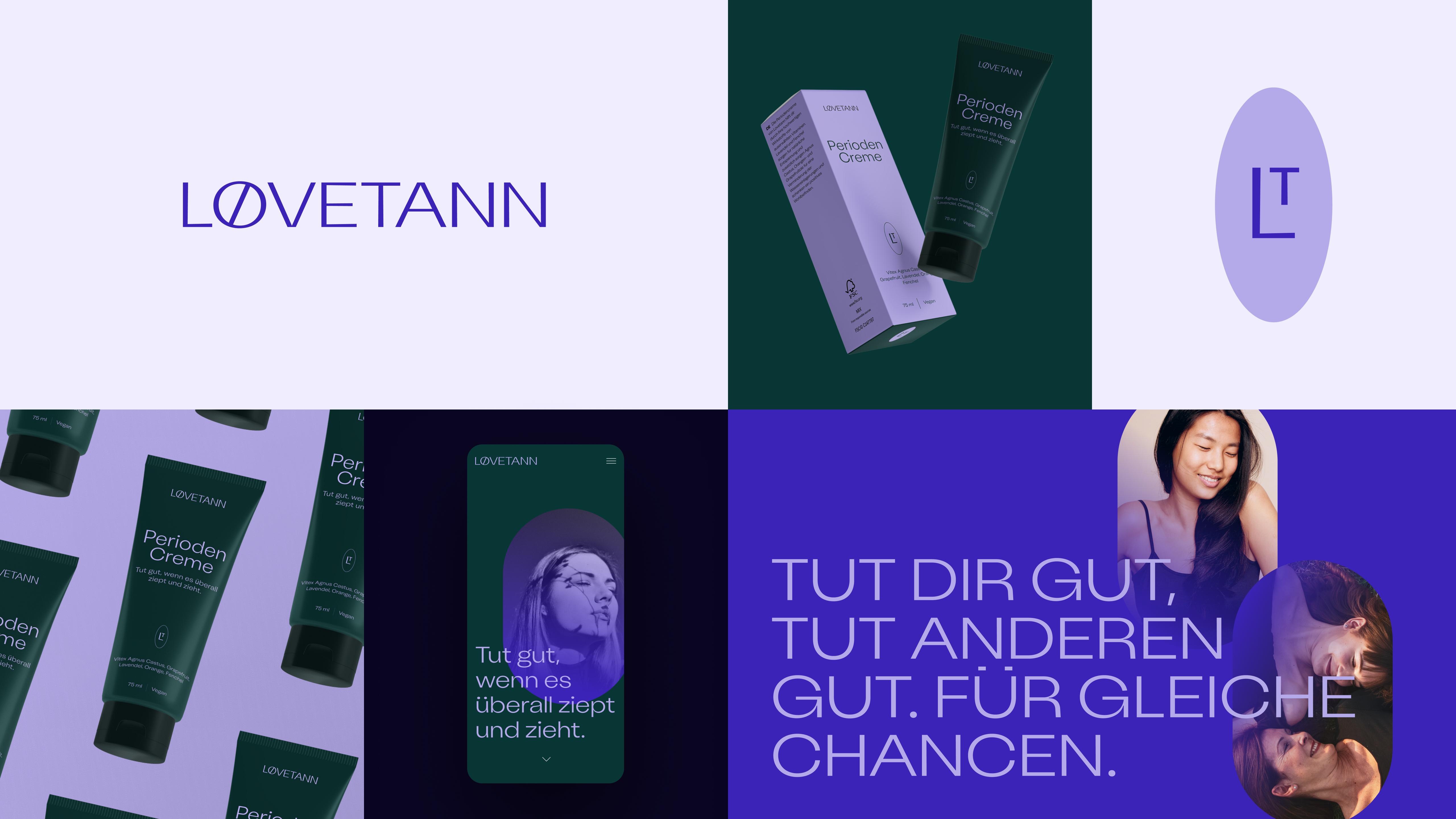
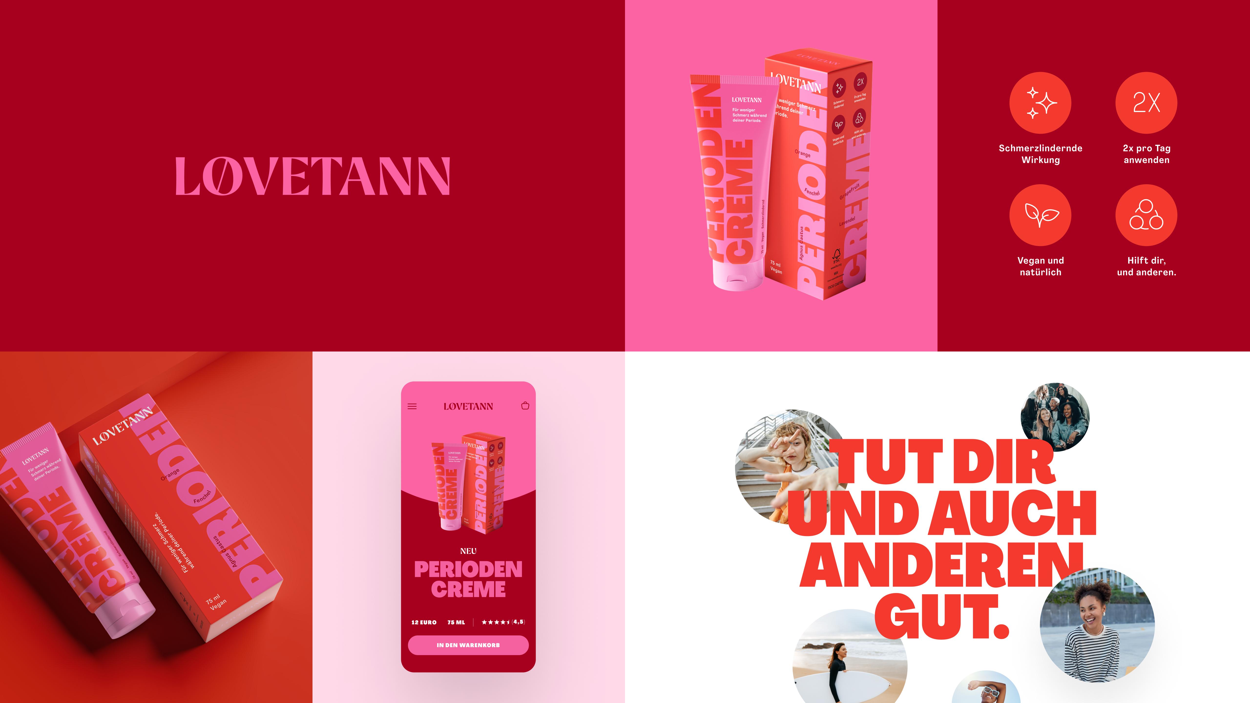
The Løvetann project began with founder Mirjam Eisele’s passion for the natural healing powers of various herbs to reduce period pain. A few prototypes later, the idea was born to turn the recipe into a real product and launch it on the German market. The task was to create a complete visual identity based on the strategic direction we had developed together. The main objective of the branding exploration was to find out how young the brand should feel in order to appeal to the target group in the best possible way. In the end, we opted for the more dynamic and bolder direction.


Initially presented directions in comparison
Lovetann is a compassionate and empowering natural care brand, offering a vegan, palm-oil-free period balm crafted to soothe and uplift. Anchored in a heartfelt mission — »you are precious and loved« — Lovetann restores comfort and confidence during women’s most sensitive days through gentle, plant-based ingredients and uplifting messaging. The brand name, derived from the Norwegian for dandelion (›Løvetann‹), symbolizes resilience and strength, reflecting how the balm helps women push through life’s toughest moments. With branding design carried out in close collaboration with your expert touch, the visual identity captures the brand’s essence: bold yet nurturing, authentic yet vibrant, inviting users to feel cared for and part of a supportive community. By blending thoughtful design with a powerful emotional core, Lovetann’s new branding radiates optimism and belonging—giving the brand a memorable edge in the natural wellness space.
Hey

